Consumers are spoiled for choice these days when they are scouring the shelves in the shops for a particular item, as lots of different brands all make their own versions of popular products – from biscuits to household cleaners. Retailers obviously display all these similar items together, so consumers have to make a choice as to which brand’s product they will put in their shopping basket. Some manufacturers will therefore end up getting overlooked, particularly if they are up against well-known and successful rivals. Many shoppers will simply go with what they know, even if an alternative that is sharing the same shelf space offers better value for money.
So what can brands that are looking to gain ground against prominent competitors do to attract a customer’s attention? The answer lies in coming up with an innovative and distinctive packaging design. If a customer has no prior knowledge about a brand and its products, its packaging will be the first thing they see – so it’s vital that they get this right.
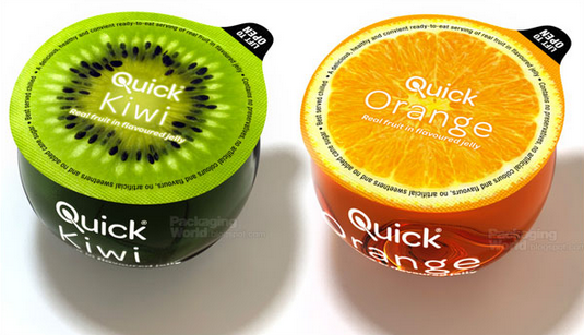
Pick a suitable colour scheme
Many people associate certain colours with brands and products almost on a subliminal level, simply because they are so familiar with the packaging they use. So for new entrants to the market, they need to do the same and pick a colour scheme that might eventually create a similar type of brand recognition. If this works, just the sight of certain hues on a shop shelf could be enough to make a person think of that company, even when they can’t see what’s written on the packet.
But they mustn’t go for a colour scheme that too closely resembles one used by another brand. This might open them up to accusations of misleading customers and is obviously counterproductive if the aim is to stand out on the shelf, rather than blend in. Picking a distinctive colour scheme can be a simple but highly effective way of attracting the right kind of attention from shoppers.
Use distinctive symbols
Many of the best known brands – such as Apple and Nike – have symbols so ubiquitous that they don’t always need to display their actual name to make themselves known. They have become ensconced in the public consciousness without people realising it, as they are so familiar.
Companies that want to pose strong competition to rivals in their market might therefore find it worthwhile spending time coming up with a strong symbol and ensuring it is prominently displayed on their packaging. While words are hugely important, the power of imagery in influencing brand recognition cannot be understated.
Packaging should be an interesting shape
A person’s eyes might be drawn to a certain item if it comes in memorable and distinctive packaging. Obviously, there are limits on how far a brand can go, depending on the type of product and ensuring an item is easy to transport and store. However, there is plenty they can do to make interesting shapes and stand-out. The chosen shape could help to reflect and convey a brand’s ethos and philosophy, letting consumers know they are interested in, say, delivering quality goods or not conforming with the crowd.
So if a company has invested in packaging machinery and uses it to present their items in an imaginative and unique way, it could be the first step towards boosting its market share and giving its rivals a reason to start looking over their shoulders.